The lay-out and design of a Blog might be as important to a Fashion Blogger as a good Camera, Computer, a steady Internet Connection (yes, mine fails every now and then) and even a Closet!
After all, a lay-out is a little "outfit" too ;) And our blogs, well they are our blank digital paper sheets to fill, no?
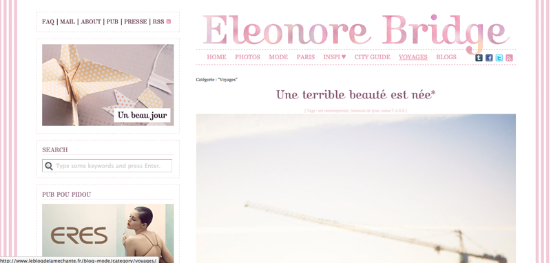
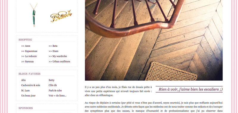
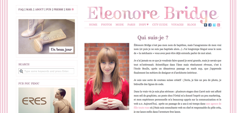
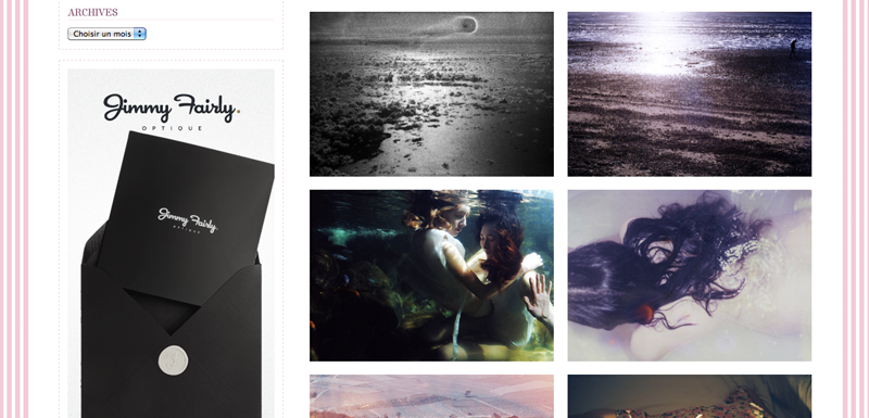
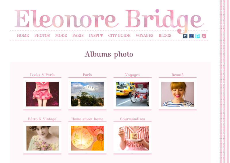
1) Eleonore Bridge
A beautifully designed blog with good use of typography and placing of images within posts plus very good navigation through the sidebar and tabs. Most brilliantly is the archiving of previous posts through thumbnails divided by categories like inspiration, fashion and travel. Also high on my lay-out list is a good introduction( the "about")!
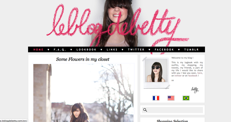
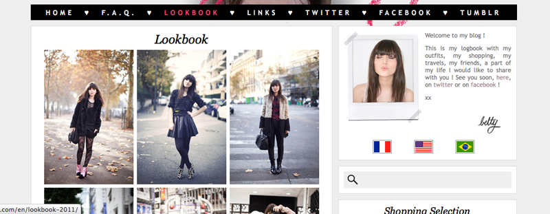
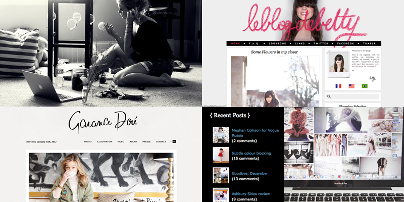
2) Le Blog de Betty
A very pleasant blog to spent some quality time on, the archiving under the tab "lookbook" shows all previous outfits as thumbnails (jay!!) which makes it easy to browse!
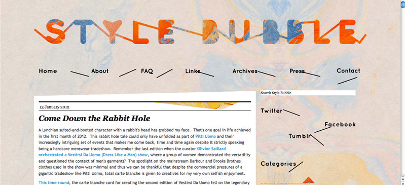
3) Style Bubble
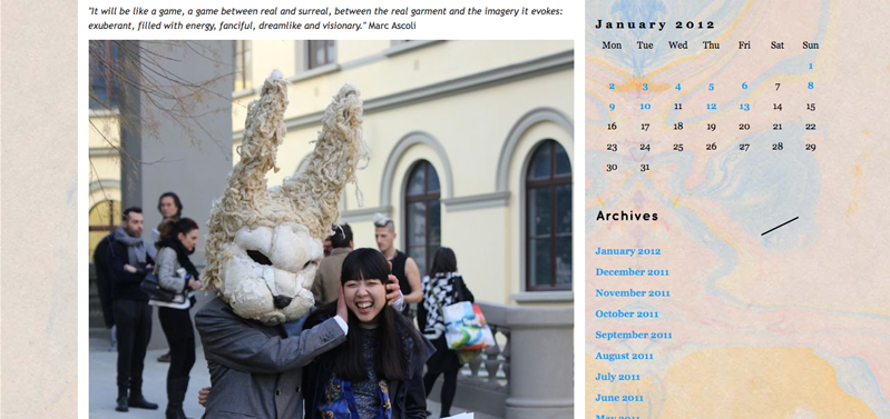
Seriously amazing Graphic Design! I'm just loving the typography and marble paper and it fits Susie's style so well! The Archiving is sadly without thumbs.. But it's made up for with a calender... (I obviously really like calenders, I don't like time but boy do I like calenders!)
4) Wish Wish Wish
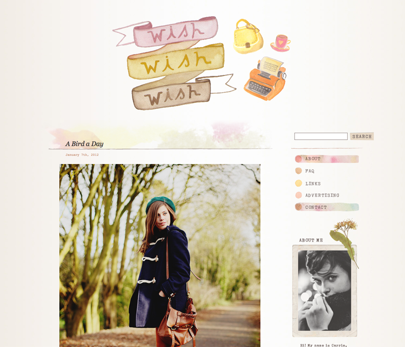
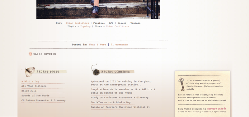
Carrie's blog feels like a home and feels very personal in lay-out, colors and design!
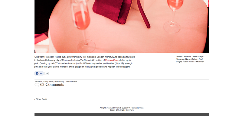
5) Park&Cube
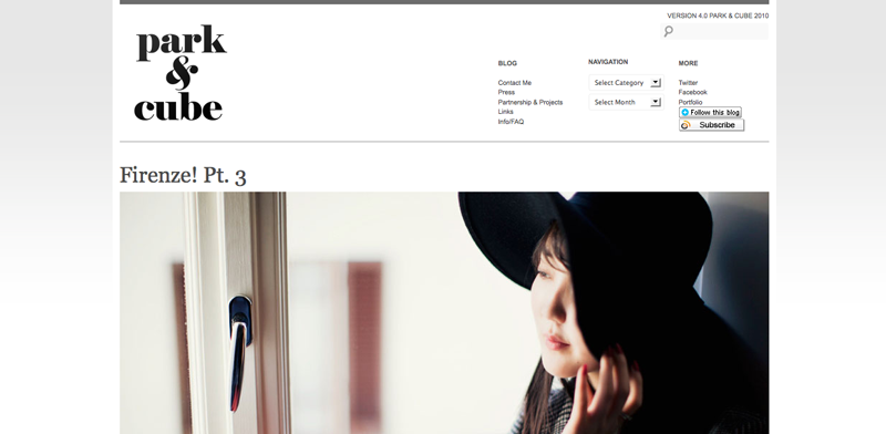
Very good graphic design as well with a good eye for typography, the blog is perfectly clean and effective. Nice placement of credits under the pictures!
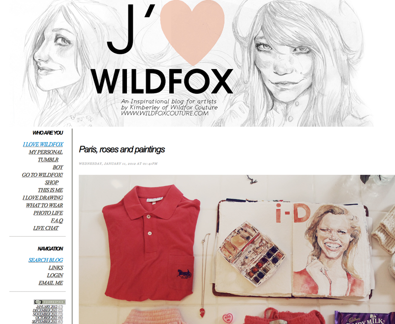
6) I Love Wildfox
Loving the mega large images but I miss good archiving of the different categories and thumbs, I would love to see all the sketches or "clothing collages" with 1 click on a button!
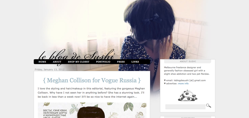
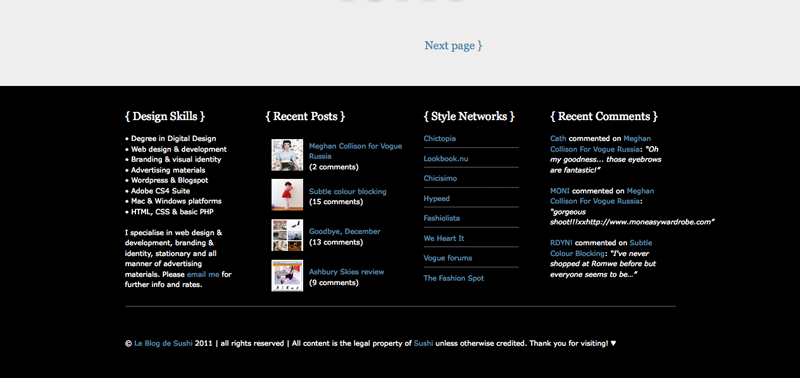
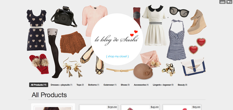
7) Le Blog de Sushi
Beautiful blog which feels like entering another world, browsing someones diary. Also I'm always very pleased with labs leading me to blog-shops! (ps. find here a great tutorial on how to add a favicon to your blog!!)
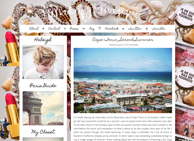
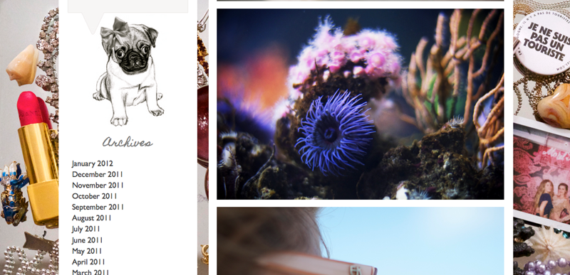
8) Making Magique
Really liking the background!! Plus the use of fonts and scribbles is done so well!
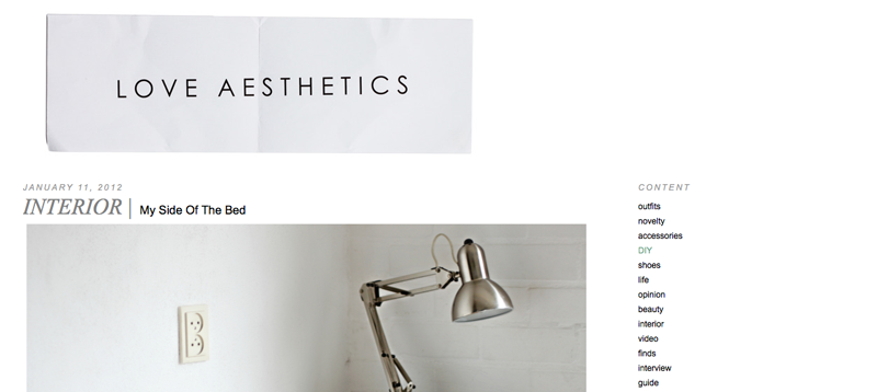
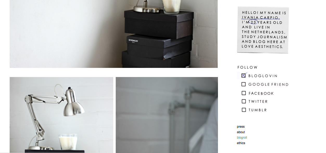
9) Love Aesthetics
Showing us that scissors, copying machines and pens still rule! Love the header and the animated gadgets in the sidebar (the profile and the follow list)
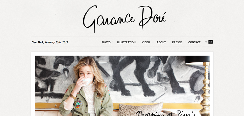
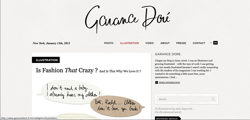
10) Garance Doré
A very beautiful and classic lay-out!
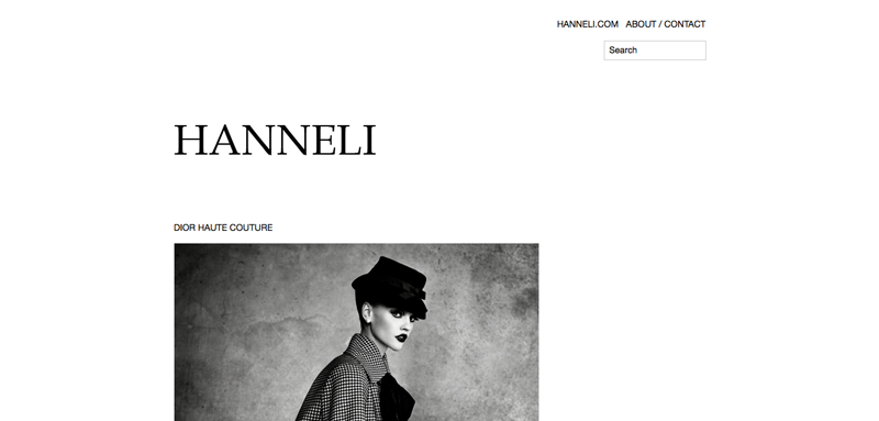
11) Hanneli
A truly minimal approach which feels very fresh and clean!
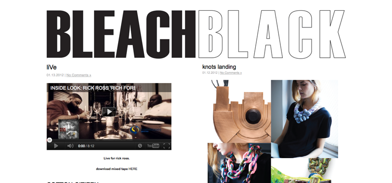
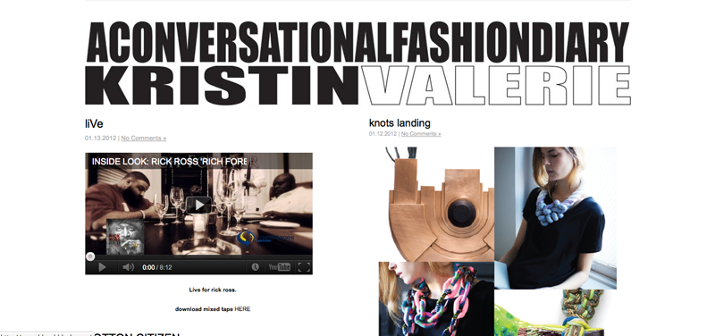
12) Bleach Black
I'm a big fan of moving/animated bold headers and the Thumb-like way of the posts!
13) Straw Berry Koi
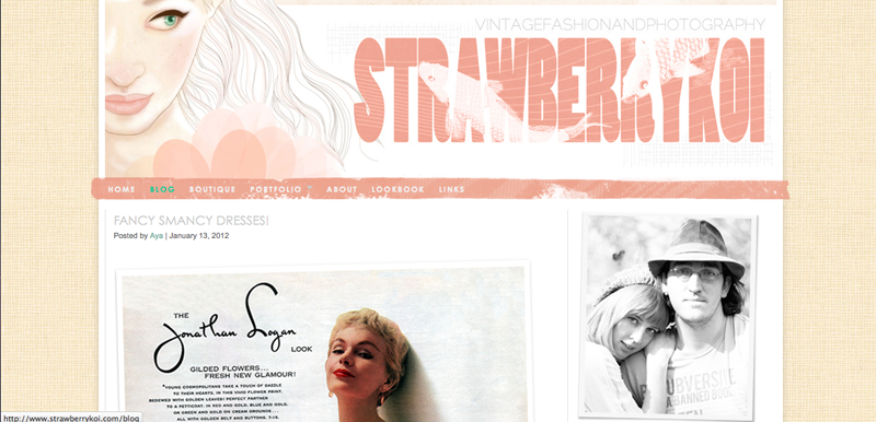
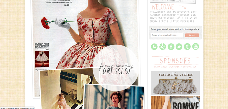
The sidebar, header, background, fonts, everything is matching perfectly and feels just right! Love the way images are placed (overlapping) within the posts!
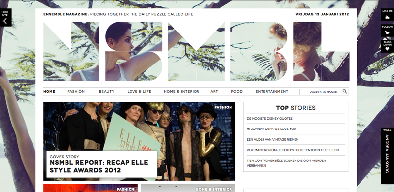
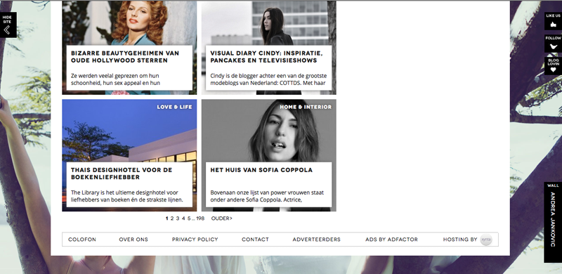
14) NSMBL
This online fashion magazine has me drooling over the use of the background image and cut-out header! Very pleasant graphic design!
FOLLOW COCOROSA ON BLOGLOVIN' FACEBOOK AND TWITTER
0 comments:
Post a Comment